
The Advanced Panelbox macro gives you control over one single panel, which the Panelbox macro deliberately does not.
All settings apply to the panel you are working on. Changes here don't affect other pages.
How to add an Advanced Panelbox
-
Open the page in the editor.
-
Enter
/Advanced Panelboxand select the macro. The configuration dialog opens.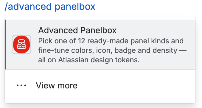
Advanced Panelbox Macro -
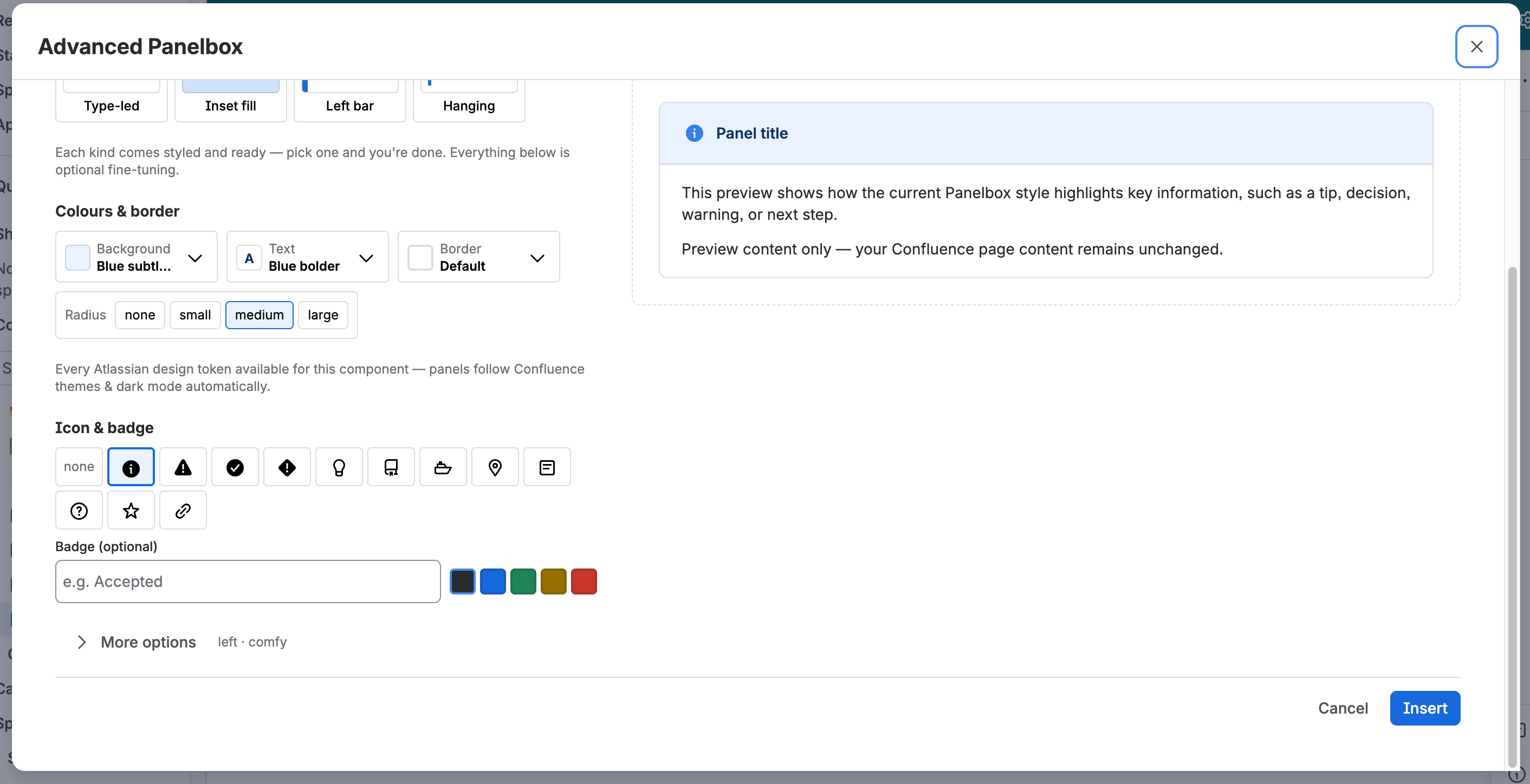
Configure the panel. The configuration options are described below, and you can work through them in any order.
-
Check the result in the live preview.
Advanced Panelbox editor -
Click Insert at the bottom right of the dialog.
-
Enter or paste your content directly into the panel in the editor.

Adding content to the Advanced Panelbox -
Publish or update the page.
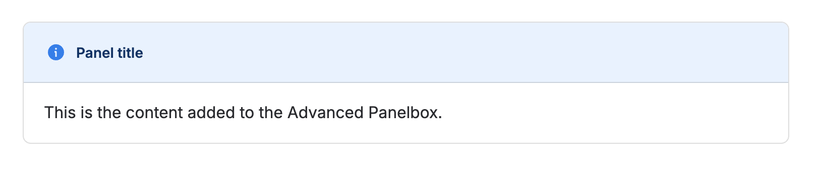
The published page shows your panel in the configured design. Colors come from Atlassian design tokens, so the panel follows each reader's light or dark theme.
If you made the panel collapsible, readers open and close it themselves.
Clicking Cancel while inserting a new panel removes it from the page. Editing an existing panel and clicking Cancel keeps it unchanged.
Configure the panel
The dialog groups the settings, and the live preview on the left updates while you work.
Kind
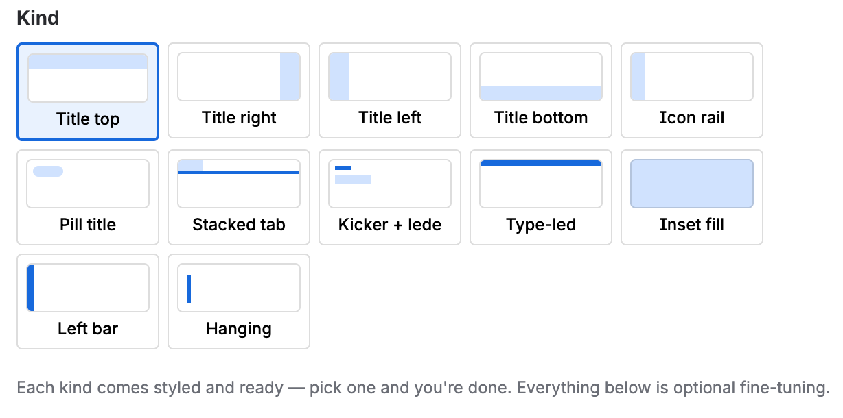
Select one of the predefined designs. A kind sets the panel's shape, title placement, colors, and icon, so selecting one is usually all you need. Everything below is optional fine-tuning. You can choose between:
-
Title top
-
Title right
-
Title left
-
Title bottom
-
Icon rail
-
Pill title
-
Stacked tab
-
Kicker + lede
-
Type-led
-
Inset fill
-
Left bar
-
Hanging
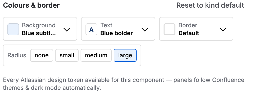
Colors and border
Adjust how the panel looks. Reset each value to the selected kind's default.
-
Background color of the panel.
-
Text color of the panel content. The icon also uses this color.
-
Border color of the frame.
-
Radius size, which controls how round the corners are.
Select colors from Atlassian design tokens rather than entering values. That keeps a panel readable in both light and dark themes.
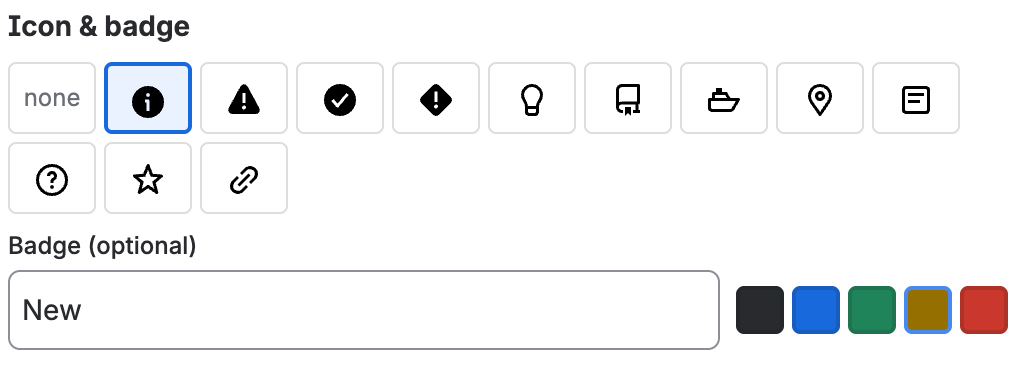
Icon and badge
Add an icon or a badge to the panel title.
-
Icon: Appears before the title and uses the text color you configured. It cannot be colored separately.
-
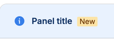
Badge: Appears after the title and shows text you enter. Select the badge color next to the badge text field.
Content
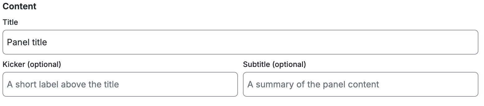
The text in the panel header. All three are optional.
-
Title of the panel.
-
Kicker, a short label above the title. Use it for a category, for example,
Step 2orReference. -
Subtitle, a summary of what the panel contains.
More options
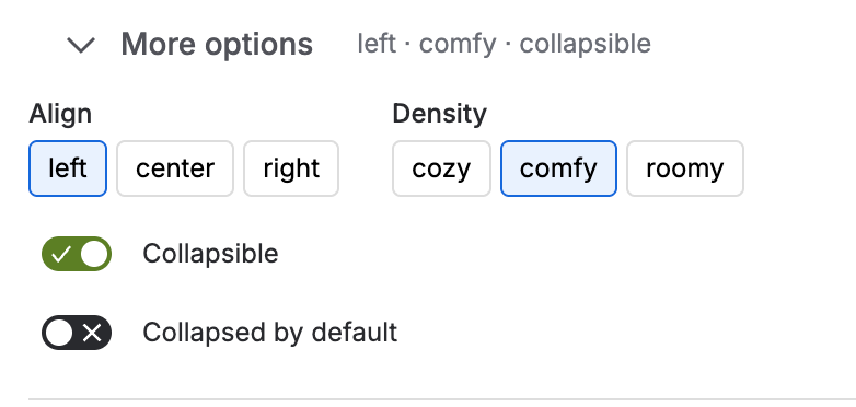
Expand More options to reach the remaining settings.
-
Alignment of the panel. Left, center or right.
-
Density, which controls the spacing inside the panel. Cozy, comfy or roomy.
-
Collapsible, so readers can open and close the panel.
-
Collapsed by default, so the panel starts closed, and readers see only its header. Available when the panel is collapsible.
A collapsed panel suits material most readers skip, for example, a long list of field values or a background explanation.
Live preview
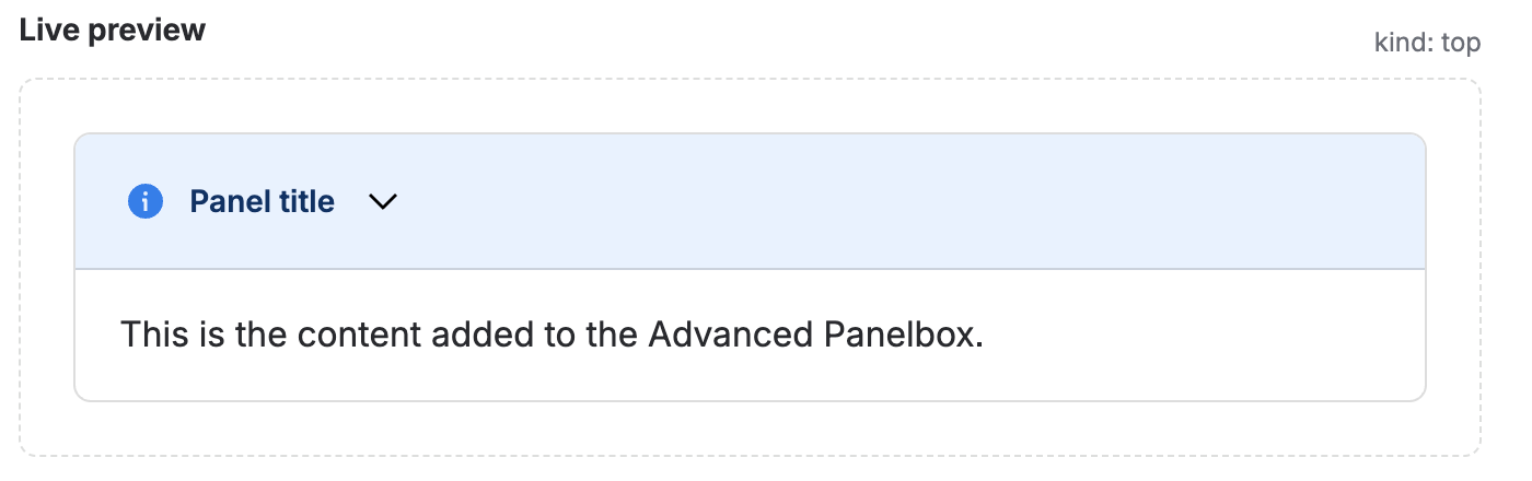
The preview shows the panel as it will appear on the published page and updates automatically as you change a setting. Use it to check contrast and length before you insert the panel.
Change a panel afterward
-
Open the page in the editor.
-
Select the panel and open its configuration. The dialog opens with your current settings.

Edit the panel -
Change the settings to your liking.
-
Click Save.
-
Publish the page.
The panel uses the new settings. Your content stays where it is.
Reset the colors of a Panelbox
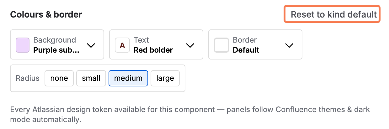
Every kind ships with its own colors. Once a color differs from that default, a reset control appears next to the Colours and border headline.
-
Open the configuration of the panel.
-
Reset the values to the selected kind's defaults.
Reset colors of a Panelbox
-
Click Save.
The panel uses the colors and the icon that belong to its kind.